Lost and Found
A lucky find resulted in Bruce Gilden’s new book - a document of the photographer’s changing approach to street photography, and a vision of a long-gone New York City
“I’m not a very organized person. Well, I organize things, then I forget them. I had all these contact sheets. I kept them mostly in order – mostly. I had all the contact sheets bundled in 100s, but during the years everything got messed up, for whatever reason. In the end I threw them all in a box, the negatives were all over the place. There must have been about 2000 rolls in the mix. What happened is that the ones I didn’t think were as good at the time, I just left them anywhere… It didn’t matter to me.”
Bruce Gilden’s new book, Lost and Found, is – as the title suggests – the result of a happy accident: the rediscovery of some 2000-odd rolls from his early days photographing New York City. The images made over the years spanning 1978-1984, had been relegated to filing cabinets by Gilden at the time, yet last summer – after a house move – he found them again, and said to himself, “These are pretty good, what the hell happened here?’”
The pictures from Lost and Found are almost all made without the use of flash which was – soon after – to become his trademark. Gilden reflects that he was “probably in a transition period at that time, wanting to use flash more and make more dramatic photos. Maybe that’s why I overlooked these images…”
Of the book, he says, “It’s Bruce Gilden, before he really became the known Bruce Gilden. But it shows that even then I knew how to compose a picture and deal with the subjects, as I have always done. I don’t think that in those ways I have ever really changed.”
In many ways these rediscovered images share much of what made his early black and white books like Coney Island and Facing New York. They are an honest, close-up picture of a long-gone iteration of New York street life, of the ‘characters’ that would become central to much of Gilden’s work.
This recurring subject matter stems, so Gilden believes, from his youth and upbringing, “Being a native New Yorker and having a gangster-type father – you know: big hats, thick grey hair, gold rings – that had a big effect on what I photographed: I never had to think about what I wanted to photograph. I knew what I wanted. I remember being in a workshop and some guy saying ‘I don’t know what I want to photograph’, and all I could say was ‘Poor you!’”
Here, Gilden talks us through a few images from the new book, revealing the imaginary scenarios and backstories he weaves for himself about his subjects, as well as how they fit into – and illustrate – the development of his personal style over time.
Lost and Found, published by Editions Xavier Barral, is available now on the Magnum Shop.
It will be published by Thames & Hudson in the UK and Europe, and distributed by D.A.P. in the US.
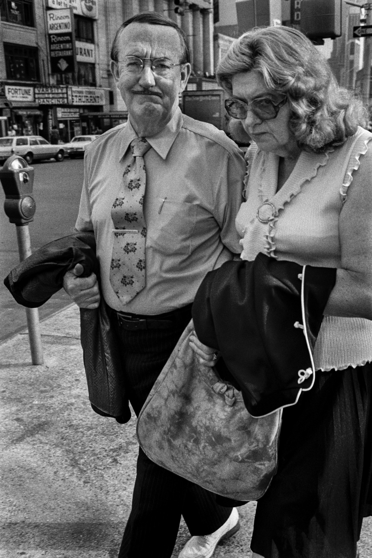
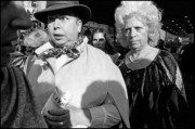
This isn’t my favorite picture in the book, but I do like it… to me, the best of my pictures are the ones you’re able to make little stories up about. This guy looks like he owns a drugstore in god knows where, middle America. He’s looking at his wife – well – I assume it’s his wife… It looks like he’s lost in the city. Walking about with his tie and a moustache. He just looks out of place. This picture also touches on my use of flash – or rather lack of flash, in this case…
Because it’s taken without flash it’s a lot quieter than my later work. Compositionally – with flash used, the picture would have popped out a lot more. What I find with a lot of people’s work is they do a lot of the same thing and they don’t change. If you’re going to keep working in the same environment – say New York City – and you don’t want to get stale, you have to find a new way of working. I’m sure that’s where my desire to use flash came from. I think that moving to using flash was a way of allowing me to stay fresh in the city photographically. What was I gonna do, continue to take the same pictures all my life?
Now this picture – this Midwesterner – yeah, that’s the kind of picture I could have taken with a flash later on. Now that we speak about it, it makes me have a thought – in this picture, I would say he comes from small-town America. But with flash it would change the dynamic of the picture. With flash he’d become a more commanding or ominous figure.
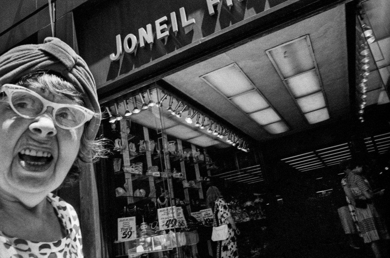
I really like this Brighton Beach picture. It’s one of my favorites in the whole book. I love it. I think it’s a son and his mother – she’s giving me a fierce look and he doesn’t recognize his ass from his elbow – doesn’t even know I’m there. I love that difference in their attitudes. The picture’s very good, she looks like a dwarf almost, I don’t know. She’s determined to succeed and he’s the next generation who might go out and amount to nothing. I could just talk about the fierceness of her in the look all day.
My pictures have a lot to do with form. Even though they’re all formed well, these pictures don’t have the perfection of my later ones, or maybe even of the ones taken at a similar time, that were included in Facing New York. In those pictures it’s the main subject that’s the primary focus and that occupies the whole frame, and generally everybody is positioned correctly. In these, they’re a little looser. Not because I was any less talented. I think it’s just the nature of the beast. You might want to photograph something in a certain way but it’s just not possible physically.
I guess that plays into this tiny lady and her son. It’s a nice relaxed image.
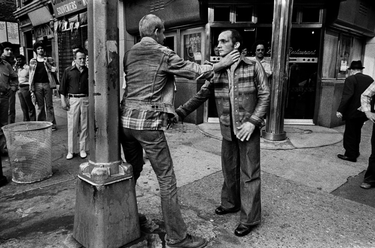
Then there’s the alcoholics, the two guys that seem to be fighting? One’s got his hand on the other guy’s neck. I seem to remember watching those guys like they were on stage in a theatre. They were out there for fifteen minutes like that. Totally fuckin’ drunk out their minds. And it almost looks like he’s not strangling him, it looks like that guy asked him to put his hand on his neck. It seemed to be two drunken, maybe gay, cowboy-like friends. It reminds me of Midnight Cowboy.
Don’t forget – at that time the city was way different. To me it was more real than it is now. It was gritty, dirty. It was a damn mess. All of that chaos fit into everything I was interested in. I was always into film noir, the idea of contrast in images. Then, later on, I started to use flash more. Flash creates drama – like I said before – and it also focuses attention on the foreground, but in the beginning – when I was shooting this the people were very much more part of the city. You see that here, these two guys – they are a part of the city, not isolated. It’s interesting: when I look at my contact sheets from this period it takes me a while to go through them… A non-flash contact sheet takes longer to look over. The flash approach was more hit or miss – either I got the shot or I didn’t. With these, its harder to tell – you need to look closely.
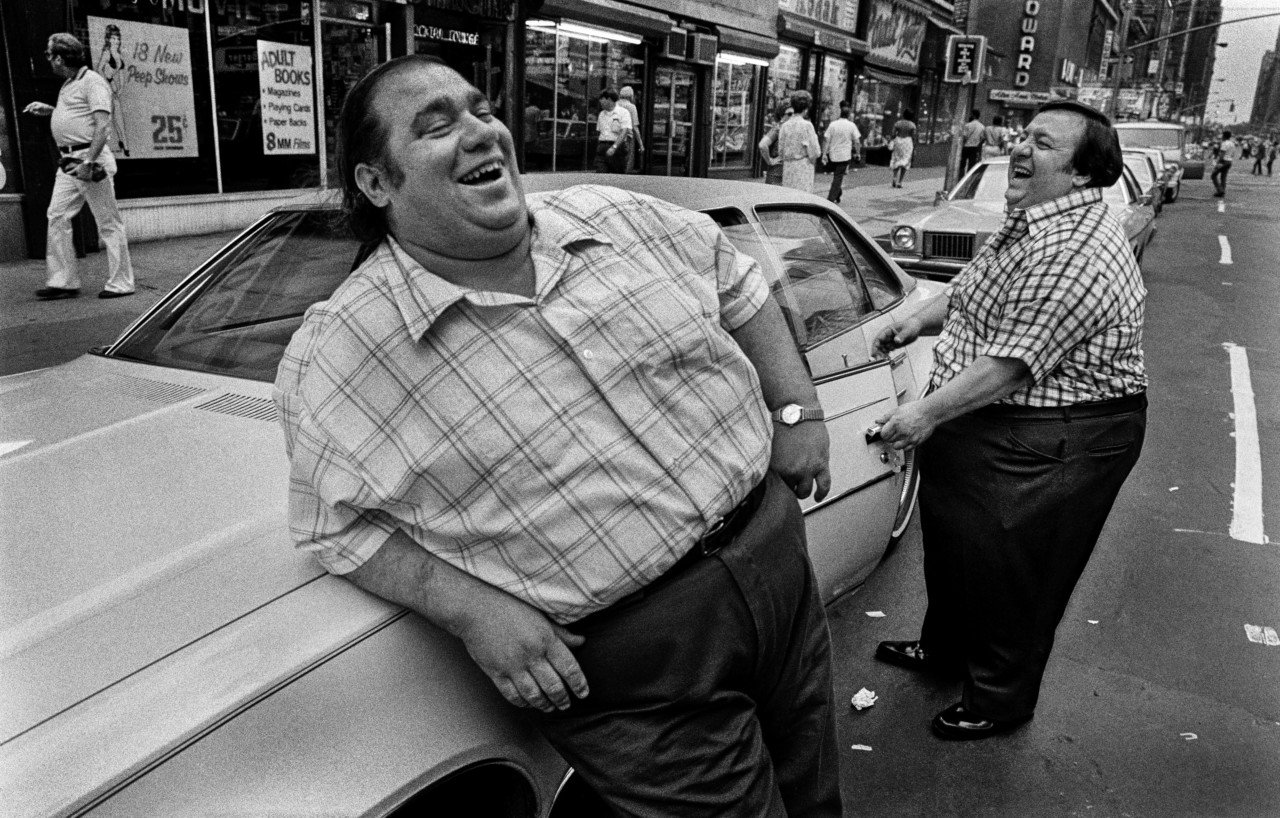
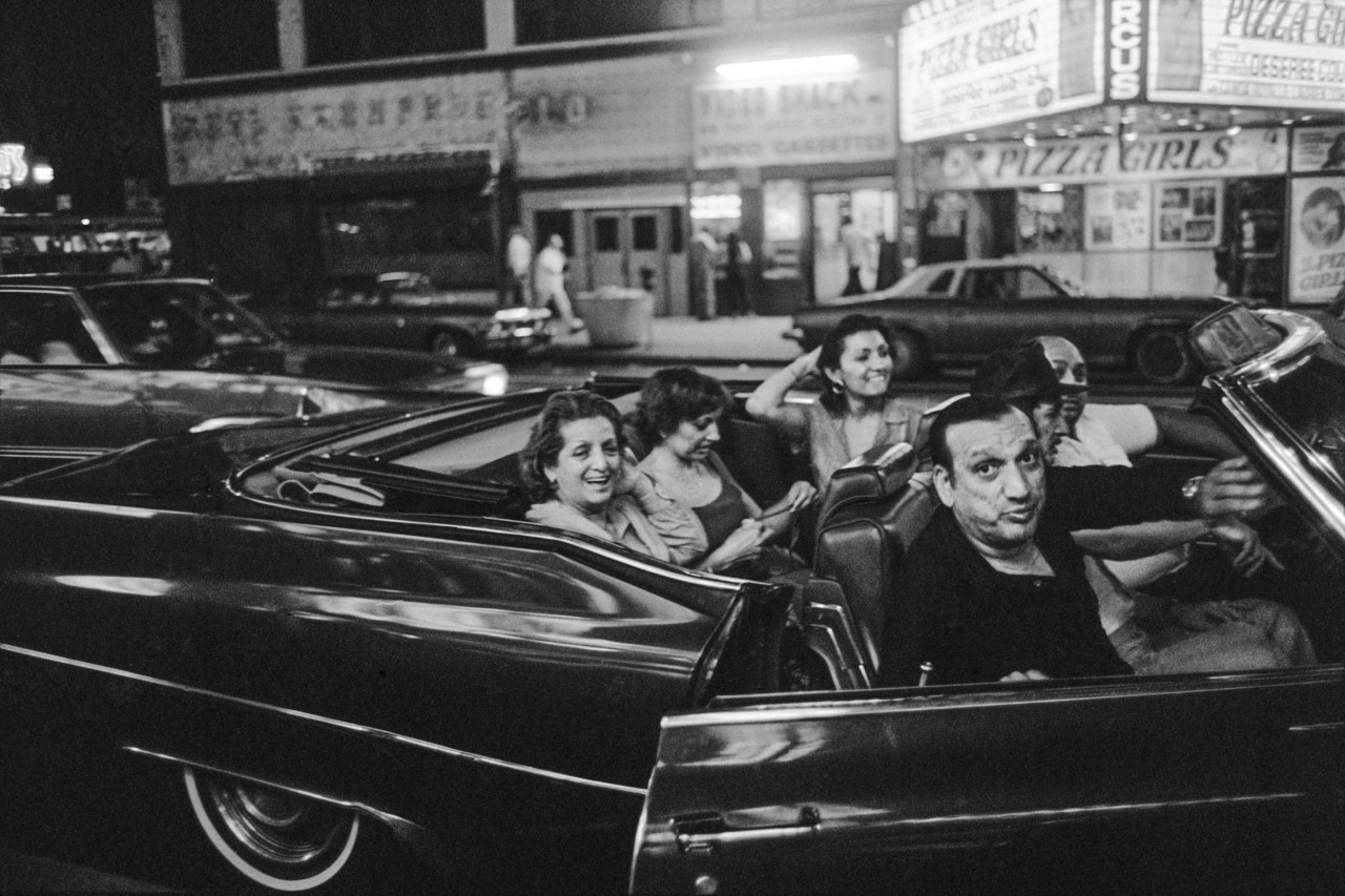
Oh yeah – this one is fun, ‘cos to me, they were like mirror images of each other. Everyone will like that picture, it’s very clichéd. Also, what makes it even better is that they look like the exact guys that would go along with the sign behind them – “peep show” – y’know? The whole “25 cents, adults 18 and over” thing? The old car…. I don’t remember it now, but I must have been talking to them, that’s why they’re laughing. They must have said, ‘What, are you taking my picture?’ I must have said something funny to them, right? Because I took a lot of pictures of them, if I’m not mistaken.
What I do enjoy with these pictures is the storefronts – that old New York – and you really see that here…. let’s go back historically. There was a guy in Vancouver who came over from Europe, called Fred Herzog, whose pictures I didn’t even know about until fifteen years ago. He did these beautiful color pictures of Vancouver, and even if his pictures aren’t as complicated as mine, they really capture the city of the time, all the storefronts, the signs on the sides of the buildings which are no longer. It gives you the feeling of the time.
Herzog worked from a distance, while I work close. When I look at these pictures, I’m always attracted to signs, whether it says ‘peep show’, ‘Burger King’, ‘cigarettes 12 and a half cents’… like I say in the book’s introduction, at that time I was taking pictures of the ‘heartbeat of the city’. Later on, I took the heartbeat of the individual.
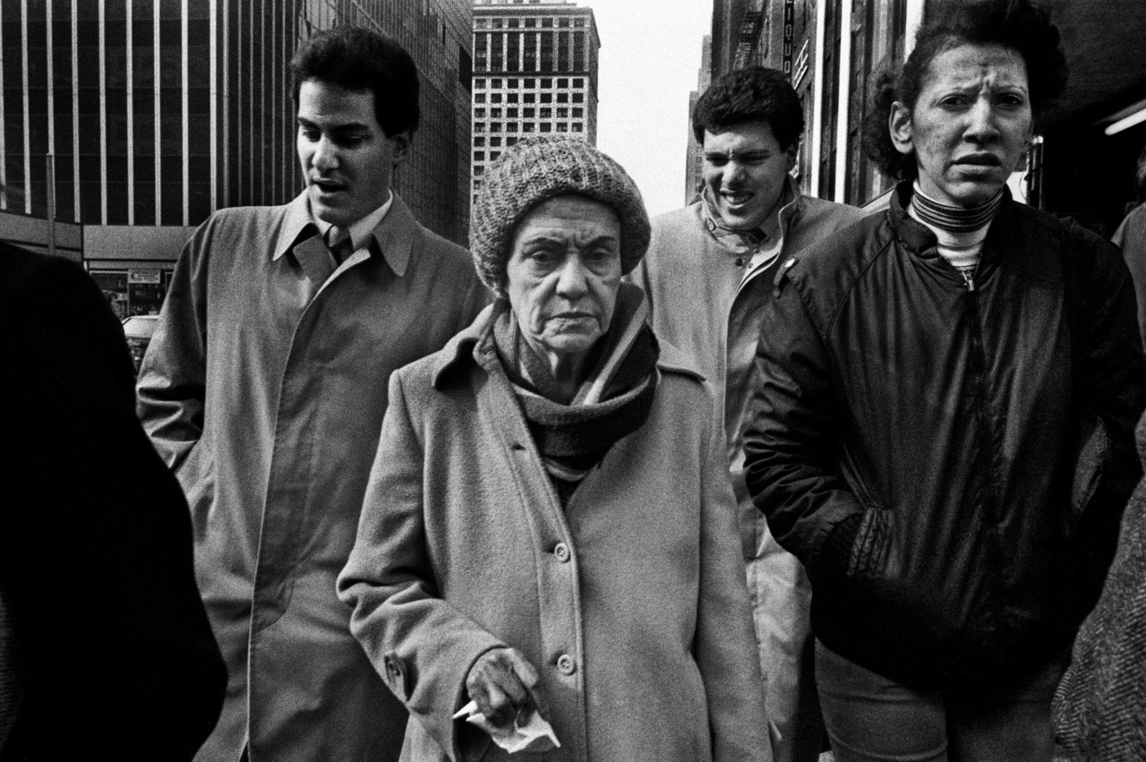
I really like this one, of the family, a mother with three sons, maybe Puerto Rican. It’s a beautiful frame too – a nice horizontal. The son next to her – the one wearing a zip-up jacket – looks different from the others, perhaps he’s gay. The two sons behind her are more straight-up, and they look anguished. The son closest to me, next to his Ma, is looking at me like he wants to kick the shit out of me, and the mother’s got a handkerchief in her hand. Like, how upsetting her family is to her ‘cos they don’t listen to her maybe, ‘cos she’s like a matriarch?
The son at the back, on the left, looks like the dapper one who turned out good – maybe he’s a lawyer or something. The other one has more trouble in his life. The son who stands out from the other two… he’s the hardest-ass out of the three of them, cos he had to fight to be what he is. To me the image is very well balanced. Four figures in the frame. Buildings behind them. To me that’s a story – the picture just makes the story for you.
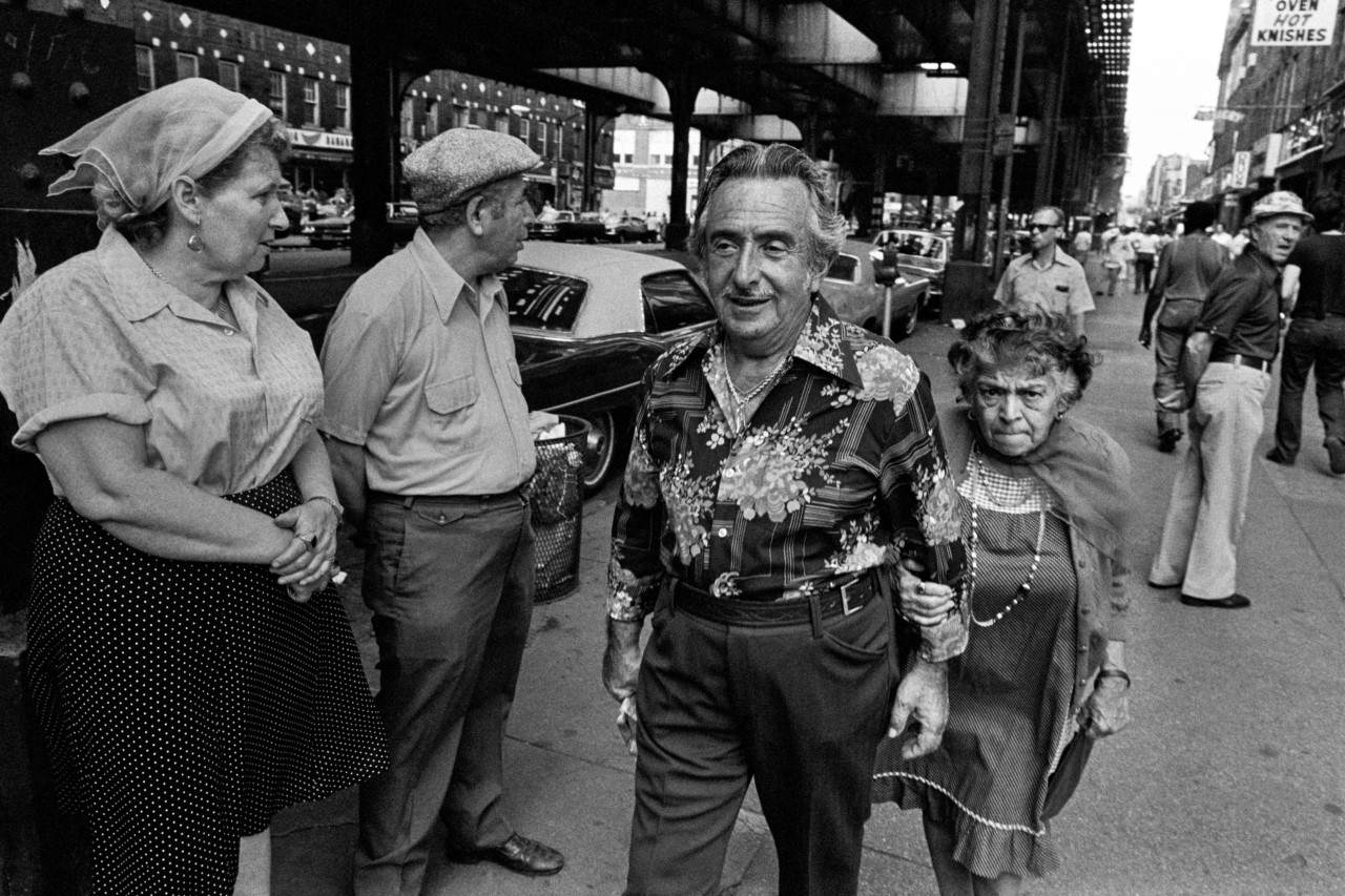
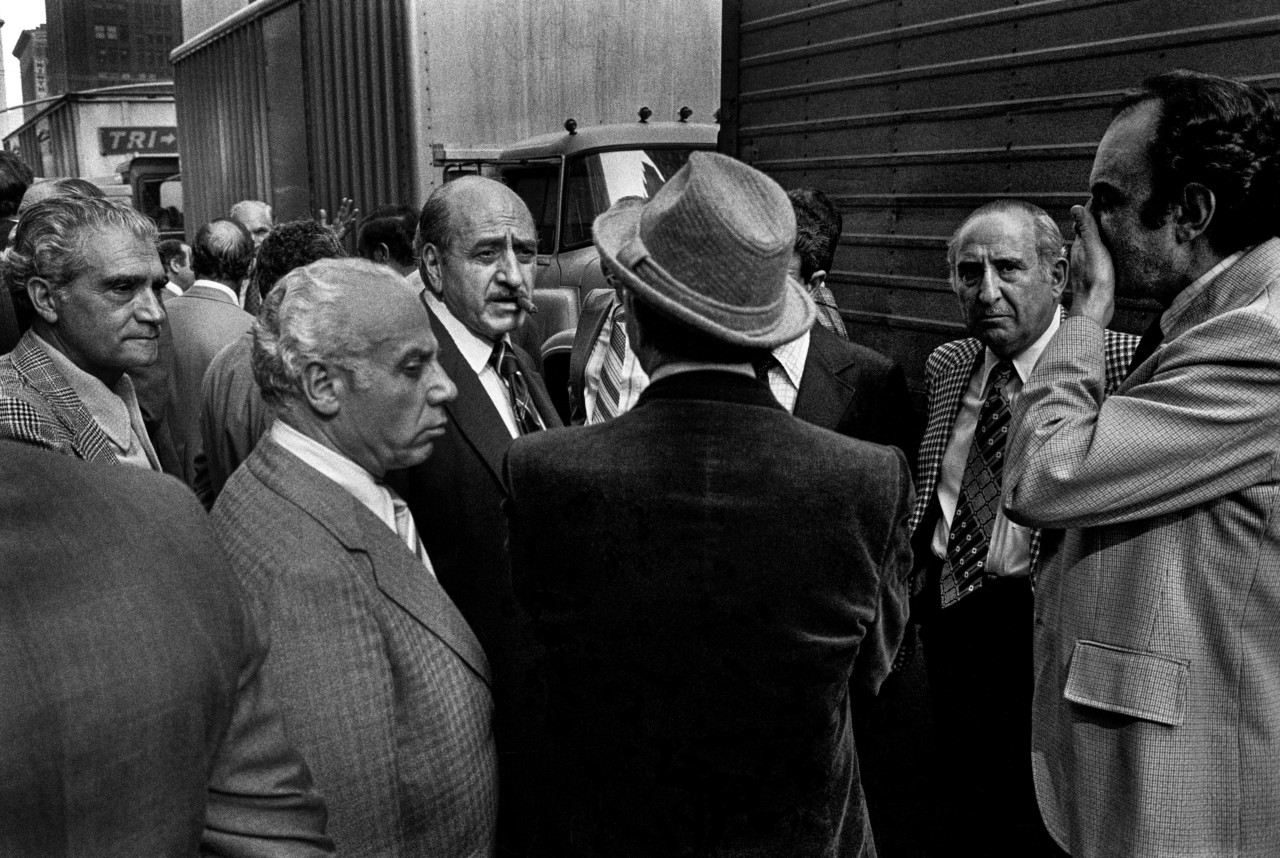
This picture looks like a scene out of a mafia movie. One guy has a cigar in his mouth and everybody’s around him. They all look Italian and they’re all tailors, I’m sure, I took it in the garment district after all. It’s very cinematic the picture. You have this guy with his hand to his face who looks like he’s just got bad news, and the other guy’s looking at me like, “What the fuck are you doing asshole?” And the guy with the cigar is like the boss.
To me this image illustrates another aspect of my work at the time. I started out working in Coney Island then went to the streets of New York City. Now, Coney Island was a cake walk. People are sat around there not moving – it doesn’t mean you will automatically get great pictures, but it’s easier. You go to the city and you have to deal with movement, it’s the best training ground for someone who wants to make the sort of street photography that I aspire to. You have to deal with the buildings, the light, people moving – you have to be quick, physically and mentally. On a beach the background is open – in a city you have people, shops, cars, lampposts seemingly coming out of people’s heads… there are so many lessons you learn.
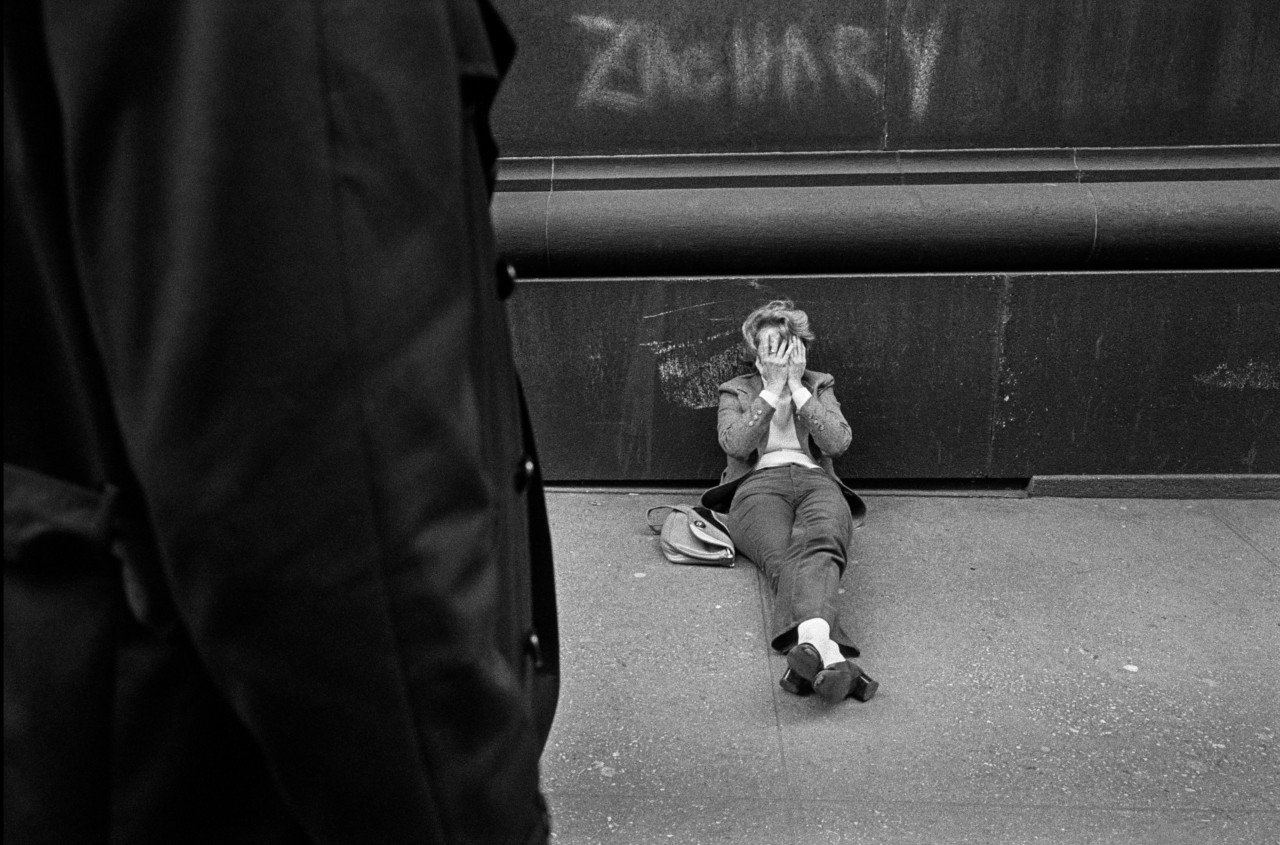
This picture has its own story. For making this picture I used, well, I wouldn’t say ‘a trick’, but it’s one of the things I use to try to make a picture more interesting. I would possibly find a great image, then wait, and put things in the foreground. You can build up layers. This picture would be empty otherwise. That’s what separates the men from the boys. The ones who are the better photographers figure out ways to boost an image, to make it a little more intricate and yet retain its simplicity.
So here, now you have a layer in the front where the guy with the raincoat leads into the protagonist in the picture. The difficulty in that is getting the first layer to fit with the other layers in the back.


